When Patco approached TRC, they presented us with an exciting challenge. As a video production agency, Patco wanted a brand identity that resonated with their creative and playful spirit. The brand name itself, a clever combination of the co-founder Shailesh Pathre’s name and the word ‘company’, was our starting point in this creative endeavour.
Goals and Objectives
• Reflecting Creativity: Our main objective was to create a brand identity that encapsulated Patco’s innovative and artistic approach to video production.
• Balancing Professionalism: While focusing on creativity, it was crucial to maintain a professional image that appealed to a broad range of clients.
Design Process and Development
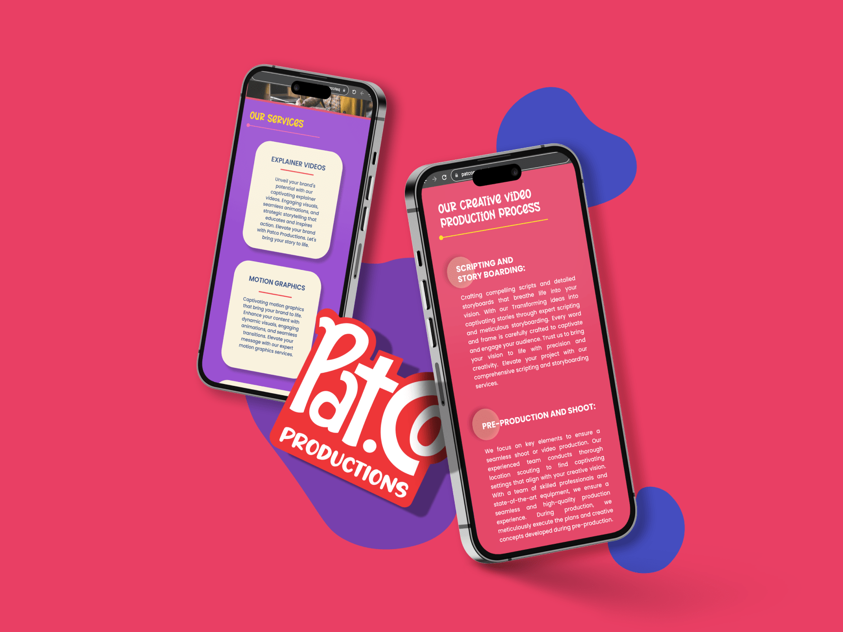
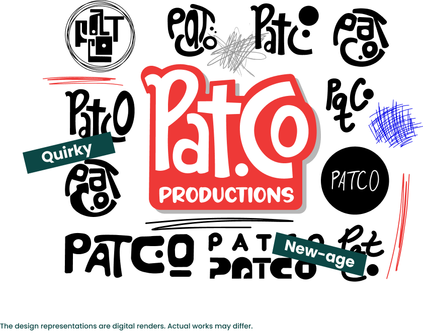
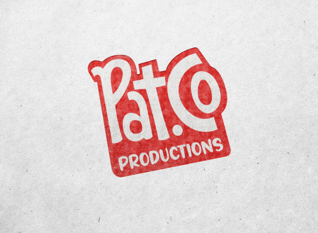
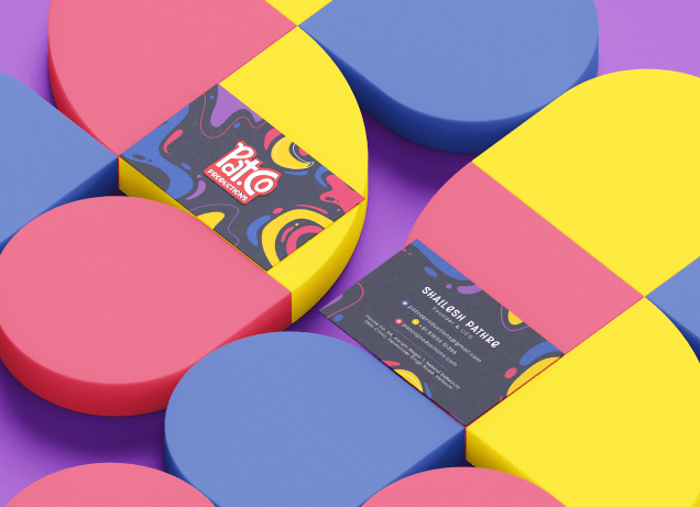
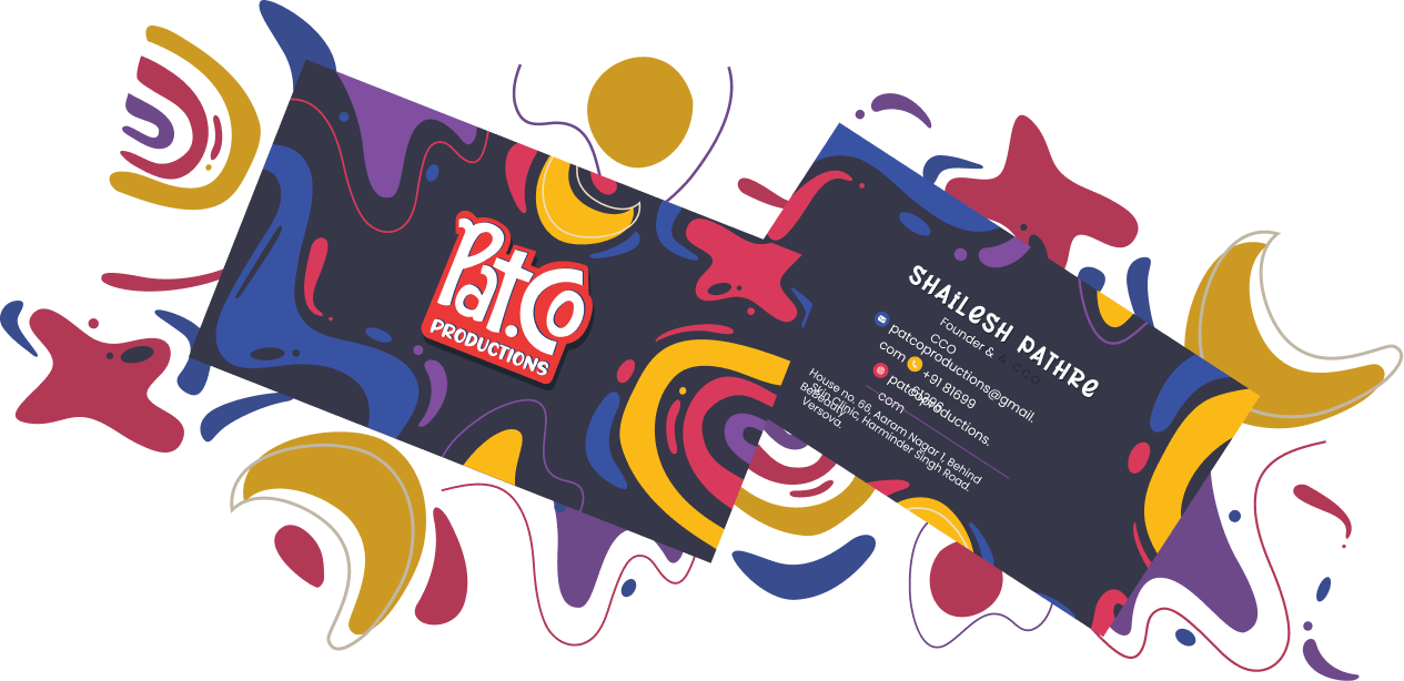
Our journey with Patco was as dynamic as their own creative process. We started by choosing bold colours to reflect the energy and vibrancy of the brand. The logo units were designed to be handwritten, adding a personal, playful touch. This artistic choice was intentional – to showcase the brand’s creative and unconventional approach. The lines and curves in the design were deliberately kept a bit imperfect, adding to the artsy and playful feel. This project encompassed various elements, including the logo,
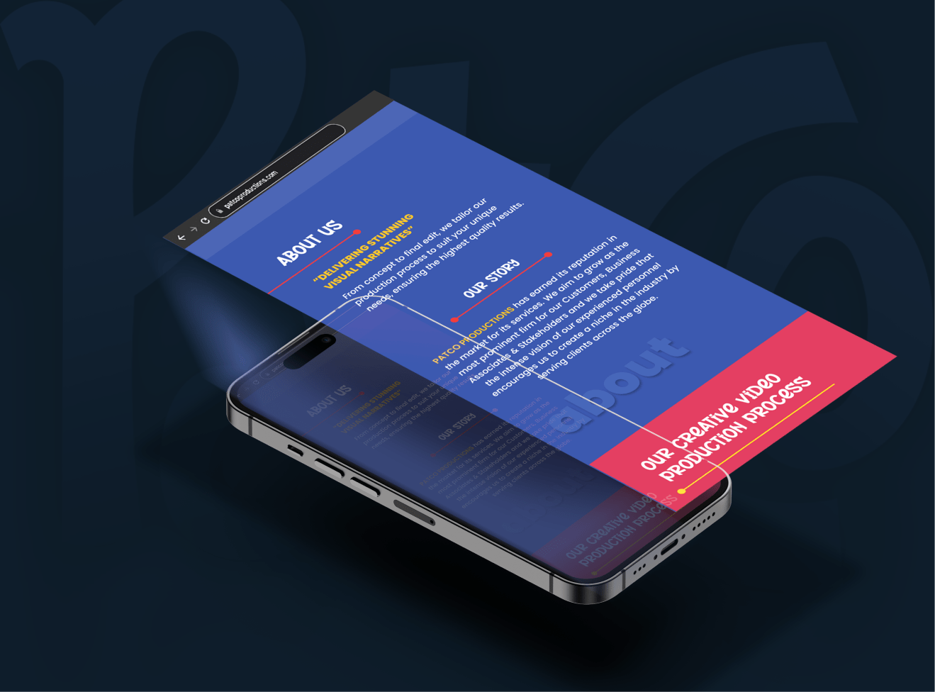
logo animation, visiting cards, and the website, each crafted to reflect the unique Patco spirit.
Success Metrics - what we achieved
• Brand Recognition: Post-rebranding, Patco experienced a noticeable increase in brand recognition within their industry.
• Client Engagement: There was a significant uptick in client inquiries and engagements, demonstrating the effectiveness of the new visual identity.
Conclusion
Working with Patco was a vivid reminder of the power of visual storytelling. At TRC, we pride ourselves on creating brand identities that not only tell a story but also become an integral part of our client’s narrative. Patco’s new brand identity is a testament to this commitment – a blend of artistic expression and professional elegance.